8 logos, and the thinking inside each one
Every mark below was designed for a real client and ships on this site exactly as it was delivered. Most of these were $30 projects; the more constructed marks ran on the $50-and-up packages. Every client left with the AI source file, transparent PNG and JPG — the mark is theirs outright.
One thing you will not find here: invented numbers. No made-up dates, no imagined outcomes. When a client gives us a sentence about their logo, we print it with their name — until then, the work speaks for itself.
Easy to Fly
Some names hand a designer the whole brief. “Easy to Fly” needs a mark that says flight without effort — so the logo is an aircraft climbing straight out of an open box. The container is a hexagon split into two blues, folded open like a departure gate, with the white silhouette of a plane lifting through the seam. The negative space does the work: the opening of the box IS the runway.
Underneath, the wordmark runs in heavy extended capitals set wide and low like a horizon — and one letter breaks formation. The F of FLY leans forward with a motion cut, a small italic push that puts speed into an otherwise planted line of type. That contrast is the brand promise in typographic form: the trip is fast, the company is steady.
- Hexagonal “opened box” with the aircraft reversed out in white
- Two flat blues, no gradients — print and one-colour safe
- The mark crops square, so the favicon came free
Rainbow Roofing
A roofing company’s logo has one non-negotiable job: put a roof in it without putting a clip-art house in it. Rainbow Roofing’s mark solves that inside the company’s own initials. Two R’s interlock — one green, one black, stepped like overlapping shingles — their shared diagonals pitched at the exact angle of a gable, with a four-pane window tucked into the negative space at the base. Read fast, it is an RR. Read slow, it is a roofline over a bright room. Both readings are correct.
The name runs in two voices — “Rainbow” in a swashed green semi-script, “Roofing” in solid black with a looping f-ligature — over the promise the lockup itself carries: YOUR ROOF, OUR EXPERTISE. Green and black is an unusual palette for the trade, and that is the advantage: against an industry of red-white-and-blue vans, this reads fresh and a little premium.
- RR monogram doubling as a gabled roofline, window held in negative space
- Two-voice wordmark balanced by a disciplined all-caps tagline
- Flat two-colour palette — survives embroidery, stencils and single-ink print
Plannet99
Some brands ask for warmth. This one asked for a badge. The Planet Ninety9 identity is built like an emblem for a marque: a PN9 monogram fused into a single hexagonal seal, the three characters sharing strokes until they read as one engraved unit. The seal sits centred inside a thin square frame — the classic move of luxury labelling — with the name running beneath in wide, letterspaced capitals, the digit 9 kept as a digit so the name stays memorable.
Monochrome is the discipline here. With no colour to lean on, the identity earns its presence from geometry, spacing and finish: flat black on white it is a stamp, foiled on a box it is a seal, reversed on packaging it is a nameplate. The chrome-on-black image is a presentation render; underneath it is flat vector, which is why every one of those finishes is one swatch away.
- PN9 compressed into one hexagonal seal — badge logic, not three letters
- Thin square keyline frame for shelf presence
- Deliberately one-colour: the rare logo with zero colour-conversion risk
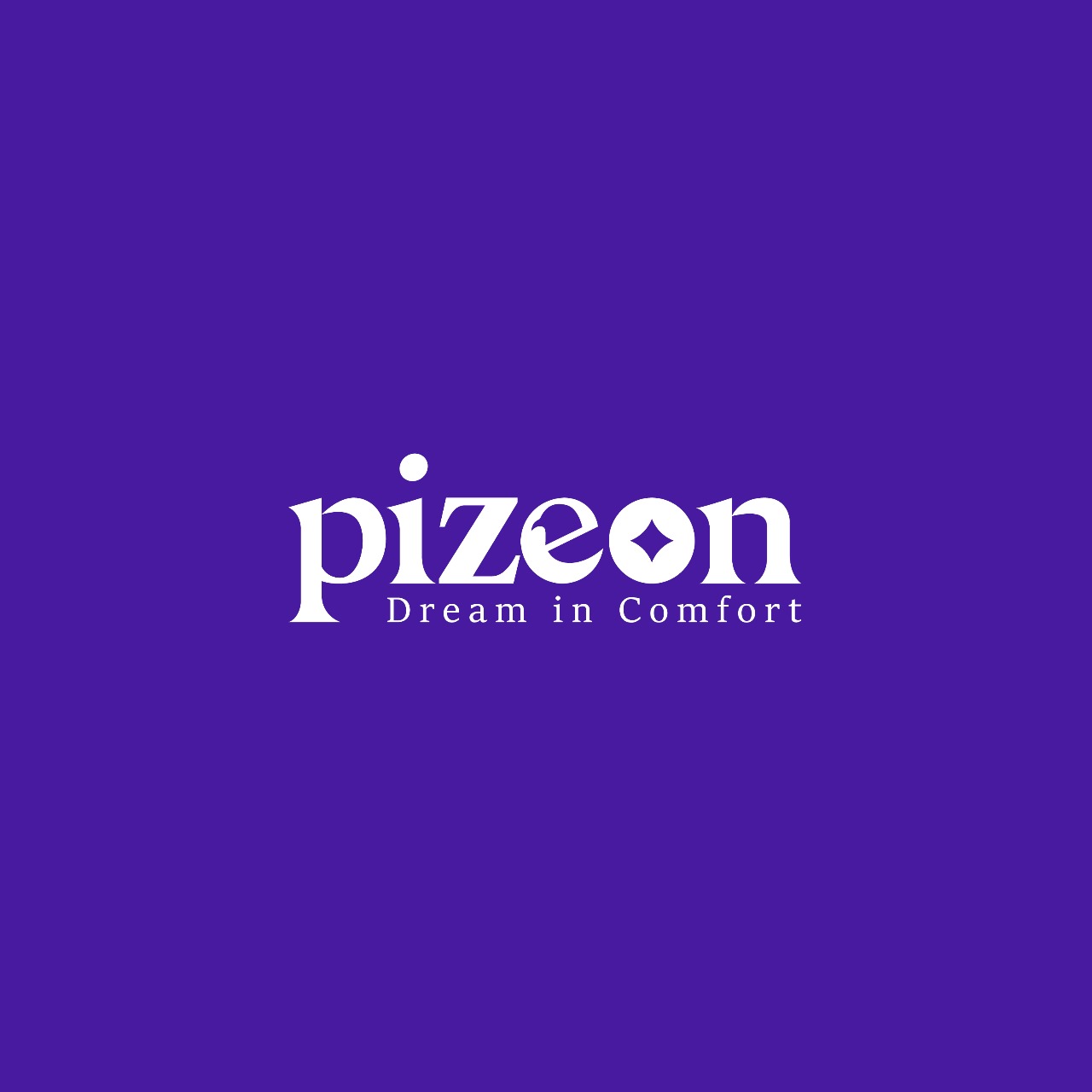
Pizeon
Pizeon is a wordmark-only identity, and wordmark-only is the harder brief: with no symbol to hide behind, every curve of the lettering has to carry the brand. Six lowercase letters in a high-contrast modern serif — thick strokes snapping to hairline thins — the sort of typography that whispers boutique rather than shouts discount. Lowercase was the right register for a brand whose own lockup promises “Dream in Comfort”: capitals would have made it a corporation; this makes it a mood.
Two letters work overtime. The i carries an oversized dot floated high like a thought above a pillow, and the o holds a four-pointed star in its counter — night, quality, or the moment before sleep, depending on who is looking. One glyph, three readings, no extra ink. White on a deep violet ground, one colour throughout: it embroiders, foils and prints on a care label without losing a detail.
- Pure typography — the type is the brand
- Elevated i-dot and a star in the o as the only two gestures
- Single-colour construction: label, embroidery and foil safe
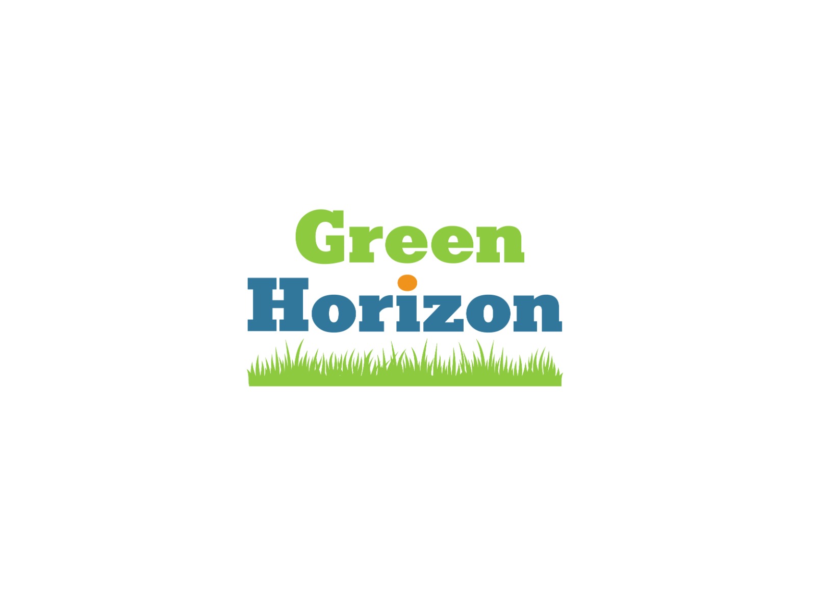
Green Horizon
Green Horizon’s logo is the friendly kind of literal: the name promises a green horizon, and the mark simply builds one. The name stacks in two lines of a rounded slab serif — sturdy letters with enough weight to survive on a lawn sign read from a moving car. “Green” is set in grass green, “Horizon” in steady slate blue: ground below sky, the name arranged the way the world is. One small sun rises inside the type itself — the dot of the i swapped for a warm orange oval, dawn breaking exactly where the eye lands mid-word.
Underneath, a hand-drawn fringe of grass grows across the full width of the lockup, uneven on purpose. Where a geometric rule would have said “corporate”, these irregular blades say “living” — and they turn the baseline into the horizon line the name talks about.
- Semantic colour split — green earth line under construction, blue sky line above
- Orange sun placed inside the type, not beside it
- Hand-drawn grass baseline instead of a geometric rule
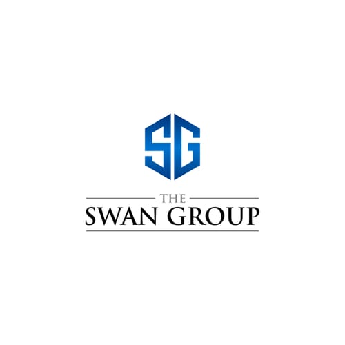
The Swan Group
A group identity has a different job from a product logo: it will sit above other brands, on report covers and building signage, and it has to look like it was always there. The Swan Group’s mark goes straight at that brief. An S and a G merge into a single hexagonal crest, cut from the same block so the monogram reads as one solid object. The hexagon is faceted in blues — deep navy edges stepping to a bright core — giving flat geometry the depth of cut stone.
The name sits below in a quietly classical arrangement: THE, small and letterspaced between two rules, above SWAN GROUP in a high-contrast serif — an editorial, almost-masthead setting that makes the company read established rather than eager. Crest above, nameplate below: etched in a lobby, blind-embossed on a report, or reduced to the hexagon alone on a lapel pin, it holds its composure.
- S+G fused into one faceted crest — a single object, not two letters
- Ruled small-caps THE over a serif masthead: establishment cues without clichés
- Facets flatten gracefully to one blue for engraving and single-ink uses
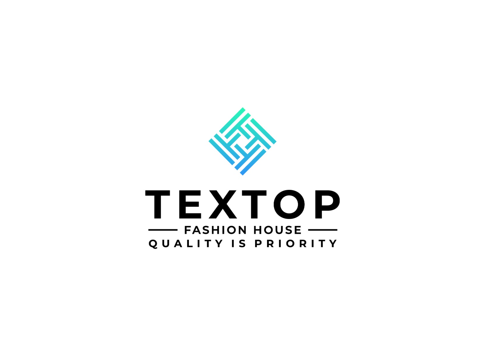
Textop
Textop’s mark is a piece of cloth drawn with a ruler. The symbol is a square set on its corner, woven from interlocking right-angled strokes — warp and weft rendered as geometry, with letterforms threaded through each other at the centre. It is the textile trade’s oldest idea, the weave, restated cleanly enough to sit on a swing tag next to international labels. A cool aqua-to-blue gradient gives the construction the sheen of finished fabric.
The type below is all discipline: TEXTOP in wide geometric capitals, FASHION HOUSE set small between rules, and QUALITY IS PRIORITY spaced along the base — three tiers, each quieter than the one above, exactly the order a garment tag reads in. The woven mark drops to one colour without losing its knot, and the extended capitals stay legible stitched at ten millimetres.
- Warp-and-weft geometry as the brand symbol — the trade drawn, not named
- Three-tier label hierarchy: brand, category, claim
- Gradient flattens to a single blue for labels and embroidery
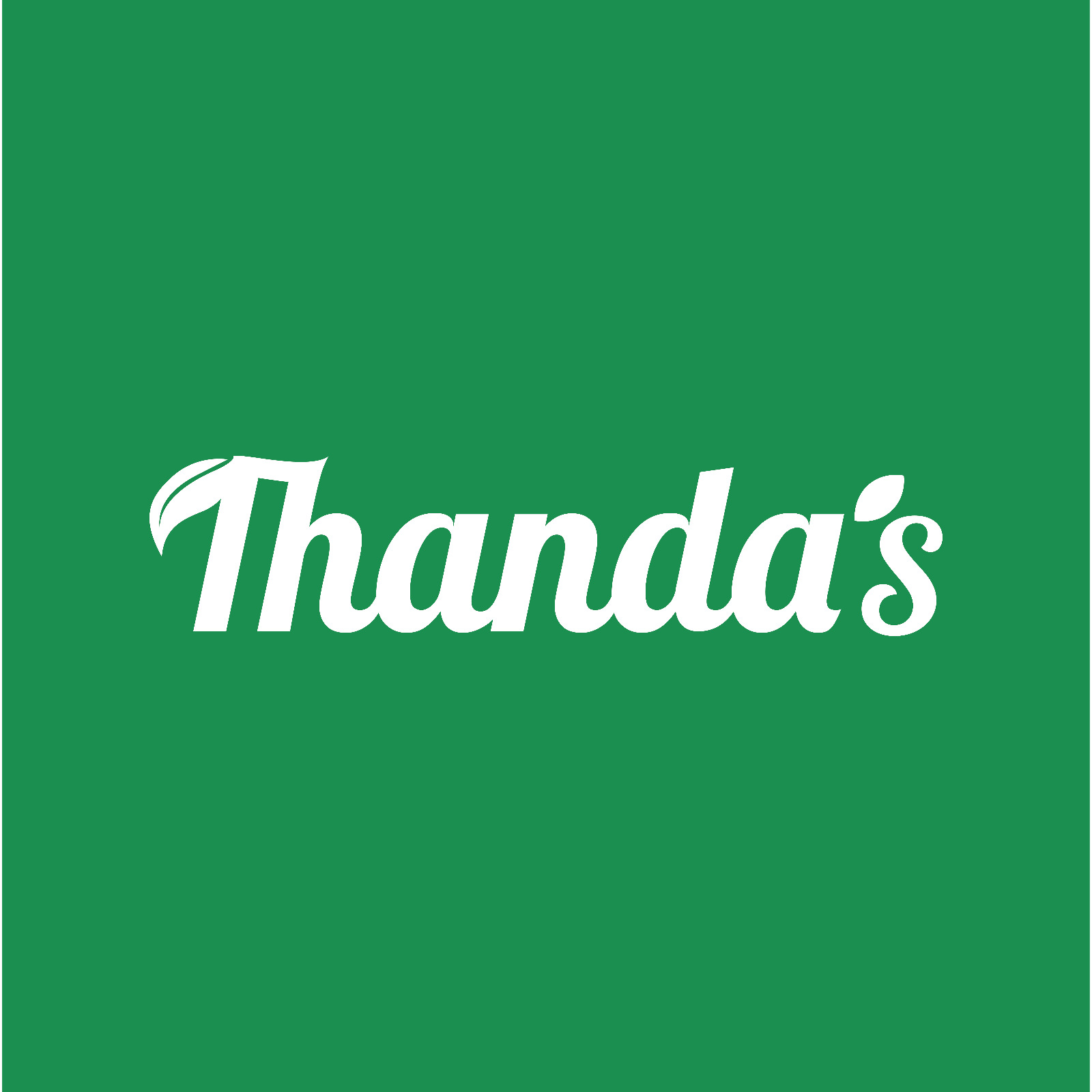
Thanda’s
The best brand names come with their own temperature. “Thanda” is Bangla for cold, and Thanda’s logo is built to feel exactly like the word sounds — a cheerful promise of refreshment, drawn the way beverage brands have drawn cheer for seventy years. It is a bold, rounded script running slightly uphill, heavy enough to own a bottle cap and soft enough to feel like a treat, in the visual language of brands people already trust with their thirst.
Two leaves grow out of the lettering itself: one caps the T’s flag, the other replaces the apostrophe before the s — freshness said twice without a single element outside the word. One colour, white, on a confident produce green: screen-printed on crates, wrapped around bottles, painted on shop shutters, the field can change with the season while the script stays constant.
- Retro-FMCG script with an upward baseline drift
- The apostrophe replaced by a leaf — the identity’s signature move
- One-colour white mark built for packaging surfaces first
A mark like these, from $30
Three packages — $30, $50 and $100 — every one with samples to choose from, revisions until you approve, and the AI, PNG and JPG files in your hands at the end.